3rd Marking Period - Multimedia
Assignment # 21A

Assignment # 21B

Assignment # 21C

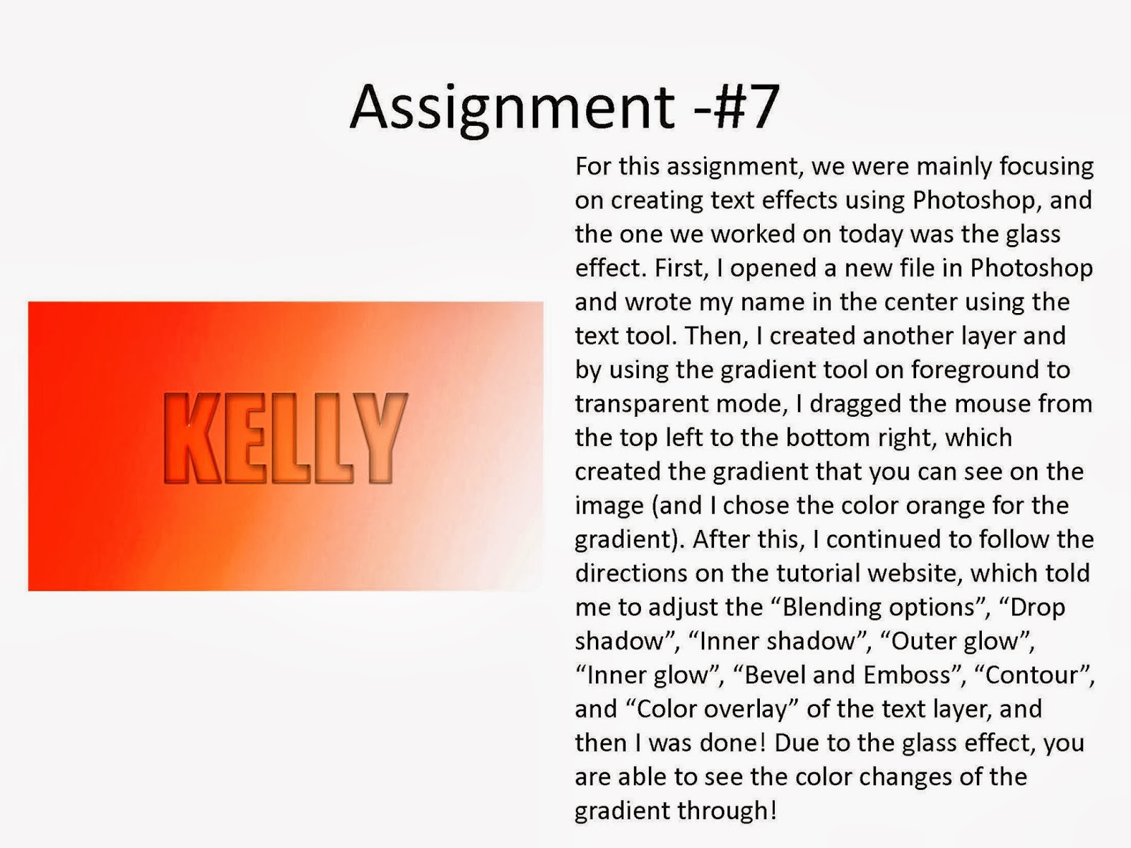
For this assignment, we started with a new unit with "Sketch Up". We were basically told to try out the main tools and create three assignments using those main tools. It was very easy for me to get used to it because the tools are very straightforward and not very complicated. You mainly draw different shapes and push/pull with another tool to create various 3D shapes and put it together to create something such as a house. However, although the first two assignments (A, B) were easy to do because you just had to draw lines and push/pull with a tool, but the third one (C) was a little difficult to do because I had to draw my own shapes of my letters and make it look like I wrote my name "Kelly". After I drew out my name, I used the push/pull tool to create the 3D effect for my name.
Assignment # 22
Isometric Block 1 - 8ft x 5ft x 5ft

Isometric Block 2 - 8ft x 5ft x 5ft

Isometric Block 3 - 9ft x 6ft x 4ft

Isometric Block 4 - 7ft x 6ft x 4ft

Isometric Block 5 - 7ft x 4ft x 5ft

Isometric Block 6 - 8ft x 6ft x 5ft
Isometric Block 7 - 8ft x 5ft x 6ft

Isometric Block 8 - 9ft x 5ft x 6ft

Isometric Block 9 - 9ft x 6ft x 4ft

Isometric Block 10 - 11ft x 6ft x 3ft

Isometric Block 11 - 8ft x 6ft x 5ft

Isometric Block 12 - 9ft x 6ft x 4ft

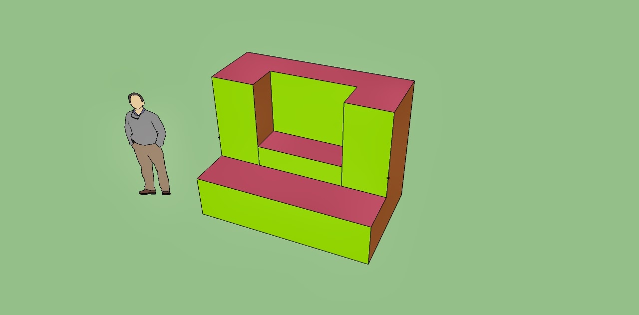
For this assignment, we were told to draw 12 different shapes that were given to us using "Sketch Up". They were very easy to do for the first few ones, but it got harder and harder after each house. I basically created the 3D block first using the drawing tool, the push/pull tool, and the measuring tool, and then used the drawing tool and the push/pull tool to eliminate the parts that I didn't need and create the same isometric block as the original block. After we created the block, we had to color them with the paint bucket tool, where the colors of the sides that were facing the same direction were colored in the same color.
Assignment # 22 QUIZ
.jpg)
My Block number was #1, and the dimensions were: 9ft x 6ft x 5ft
This assignment was a quiz to review everything that we have learned since the first assignment of the "Sketch Up" unit. My block number was #1, and the dimensions were: 9ft x 6ft x 5ft. I basically created the 3D block first using the drawing tool, the push/pull tool, and the measuring tool, and then used the drawing tool and the push/pull tool to eliminate the parts that I didn't need and create the same isometric block as the original block. After I created the block, I colored them with the paint bucket tool, where the colors of the sides that were facing the same direction were colored in the same color. I also included the original picture on the side of the block.
Assignment #23 - 3D Gingerbread house
Original Picture:

Back view:

Front view:


For this assignment, we were told to create a 3D Gingerbread house using "Sketch Up." We had to pick a gingerbread house from Google that we wanted to create ourselves, and make it look exactly like the original gingerbread house. It was very difficult for me to create the same shapes and looks, because there were a lot of tiny little shapes on the gingerbread house. I basically used what I learned from making the blocks from the previous assignments (where I drew out the basic block first and used the push/pull tool to create the 3D effect of the gingerbread house) and I also tried out new tools such as the "freehand" tool (for the falling snow, the little stars, the christmas tree) and the "rotating" tool (for the opened door) for other tiny details of the gingerbread house.

For this assignment, we basically had to use the gingerbread house that we created (using "Sketch Up") ourselves to create a "3D viewing of my Gingerbread house" using "Photoshop". First, I transported my Gingerbread house to "Photoshop" and cropped the Gingerbread house to place it on top of one of the Christmas plates, which is an image that we had to find from Google. Then, I duplicated the Gingerbread house layer and moved it to the right a little, and then I changed some of the color effects for both layers, in which I manipulated the "RGB" of both of the layers. After this, when I saw the final image with the 3D glass on, the Gingerbread house popped out of the plate, creating a 3D viewing effect of my Gingerbread house.
Assignment #25 - Animation Button

For this assignment, we were told to create a glowing button using Photoshop, in which the button would glow in the color green. First of all, I wrote the text and colored the background in grey. Then, I followed the steps from the tutorial website and downloaded the power button image. After this, I finished editing the glowing button using the tutorial, and then I started working on creating the animated glow effect, in which the button would glow in the color green and go back to its original phase.
What is GIF?
GIF stands for "Graphics Interchange Format", and it is a format for compressing image files. Basically, "gif" is the format for pictures, in which the pictures are small moving pictures. Plenty of people use this file and attach them in order to create a "moving image" effect.
How does animation work?
Animation is basically a filming of a sequence of drawings, pictures, or positions of things in order to create an illusion of movement. It is essentially an optical illusion of motion, due to our persistence of vision.
Assignment #26 - Showcase your favorite merchandise - Final Test

For the first 100 points, I basically followed the directions on the tutorial, in which I created multiple rectangles to create the showcase box using Photoshop. I then added different layer styles to each of the rectangles to give it the gradient and shiny look of the showcase.

To complete the "part 2" of the project, I had a few problems dealing with the lightings, in which I couldn't figure out how to use some of the tools to create the gradient effect of the lights to give the shining effect. In addition, I think I asked about 2 questions mainly during part 1 while I was working on the rectangles for the showcase, in which I believe asked Ms. Wang to help me with the rulers. (I don't really remember the second question.) However, ultimately I did solve all the problems that I had faced due to the help from Ms. Wang and I was able to finish it myself!
Assignment 27 - Making a brochure with Publisher and wrap up for 1st Semester


For this assignment, we were told to create our own brochure of our own schedule using Publisher, which takes us back to our first assignment where we had to create our own business card. After selecting the appropriate template, we were given a sample of how our brochure had to look like, so I basically followed the guidelines on the sample brochure. In the first page, I wrote a brief description of myself, my school, and my overall schedule while I am in school. In addition, I was able to add my first two classes, in which I wrote a brief description of each of the classes. And then, for the next page, I basically did the same thing, where I added in my next 6 remaining classes and wrote a brief description for each of the classes and added the teacher's names.
REFLECTION of the entire semester!
1. Publisher - Although I still don't really have a clear idea of what exactly this software does, I do know that it is useful for business people. This software wasn't my favorite, mainly because the functions and the tools of this software wasn't as interesting as the other softwares. However, because the tools are pretty basic and straightforward, I didn't have any difficulties while working with Publisher.
2. Photoshop - Photoshop was probably my favorite software out of the 5 mentioned, which could be due to the fact that I was familiar with most of the tools and the functions in Photoshop. In addition, I feel like we did more interesting projects using Photoshop (and this software was used the most probably for most of the projects that we worked on).
3. Sketch Up - Sketch Up was probably my least favorite software out of the 5 mentioned, due to the fact that I wasn't familiar with any of the tools at all, and the software itself made me dizzy. In fact, I experienced a lot of problems while working with this software.
4. Power Point - This software is probably the one that I use the most outside of school, therefore I didn't experience any difficulties using this, and because we didn't do any interesting projects with this software, due to limited resources and tools/functions, I didn't particularly dislike it or even like it.
5. Illustrator - Although we didn't use Illustrator as much as the other software's, it was an interesting and new experience for me. Although I had some difficulties getting used to the locations and the functions of the tools, I was able to adapt to it later on when I was almost done with the project.
Overall, from this class, I have learned a lot, in which I learned that it does benefit you to know all the softwares, because different softwares can be used for different occasions. In addition, I have learned again that I shouldn't procrastinate and also that I shouldn't always just ask for help to people and try to figure problems out by myself. Therefore, I will take these things in mind, and hopefully I will not do these mistakes in my next elective course again. Thank you Ms. Wang! :)