Assignment #11


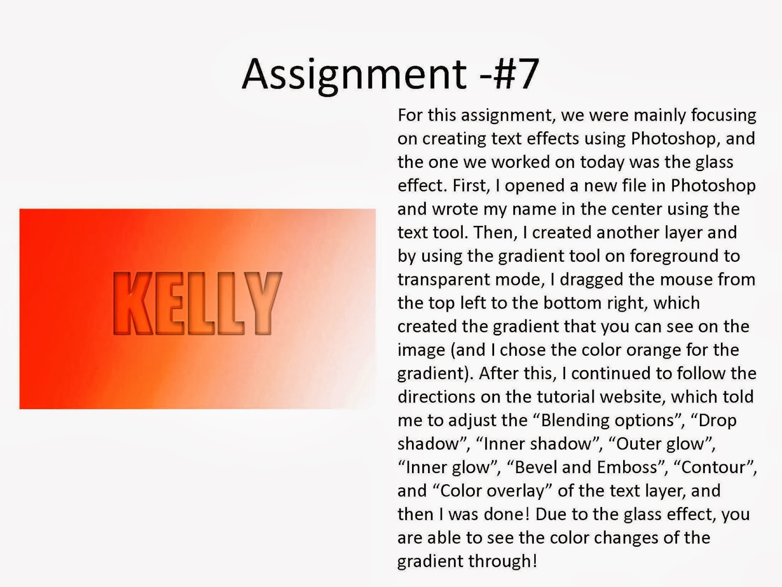
Assignment #16 - Smart Filtering with Motion Blur

For this assignment, we were told to experiment with smart filters by creating smart object layers and filtering the images with the motion blur filter to make it seem as if something was moving very fast, which is why we used the train as our image. To create this effect, we used Photoshop, and we just had to follow a few easy steps to create this effect. In addition, I applied the motion blur filter on the trees and not the train to make it seem like as if it was moving very fast. For the other details, I mainly followed the directions on the tutorial.
Assignment #17 - Quick Masking to add a desire effect
 For this assignment, we were told to edit an image, in which I chose a picture of a woman with yellow teeth, by quick masking the areas that we would want to edit and apply it so that her teeth would look white instead of yellow. First of all, I chose the picture of this woman, because she had yellow teeth, in which I wanted it to make it seems like as if she had white teeth. I mainly followed the directions on the tutorial for the other detail work that I had to apply my selection. However, basically I just used quick mask to create a mask and edited and turned it into a selection by painting with black/white colors. By using this masking technique, I was able to mask the areas that I painted and transform the color of her teeth to a white color.
Assignment #18 - Soft Filtering Skin tones.


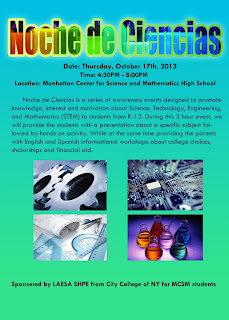
For this assignment, we were told to create a flyer for an event called "Noche de Ciencias" using Photoshop. In the flyer, we had to show what we have learned throughout the 1st marking period, and apply it on the text, background, and whatever we wanted to put on the flyer to make it interesting. I created the title, and I used the "Photo-filling text" effect, by using the directions from the tutorial and filled the text with an image of colorful bottles filled with neon colored solutions. After I was done with the text, I created the background by using the gradient tool 2 times, from the top to the bottom and opposite (blue and green). Then, I included the information about the event, and we had to include the "What, When, Where, Why, and Who" using the text tool. Finally, I got 4 images that related to the event and placed them on the middle of the flyer.

Assignment #12
For this assignment, our main goal was to learn how to texture layers by using the clipping masks and control the opacity/visibility of the textures on top of the layers. First of all, we were told to find a picture of a suit or a dress and also a picture of some kind of texture. Then, using Photoshop, I had to crop out the dress and clip the texture layer to the dress layer. Then, I lowered the opacity of the texture layer, which made the bottom layer, the dress layer, show through and the texture could be seen on the dress. Finally, using the "Layer Mode" I changed it to "color dodge" and I was able to control how the texture would look like on the dress, and then I was done!
Assignment #13

For this assignment, we were told to make a flyer/poster for the "Food Bank NYC's EAT WISE Program for Teens". Basically, we have to mimic the different effects/elements that were used for the example that they have on their website (using Photoshop). I chose to use a donut for the main topic for the flyer. First of all, I got a picture of a sliced apple, in which I cropped the background of the apple with the magic wand tool. I then got a picture of an actual donut and erased half of the donut and created a clipping mask with the apple. Then, for the background, I chose a solid color without a gradient, because I added the gradient or an outer glow for the apple so that it shined outwards. Then, I wrote the content for this flyer, and added in the logo on the bottom, in which I also added the outer glow so that it shined outwards. I also created a rectangular shaped box with the rectangular tool, and placed it on the bottom of the words "eat an apple for healthy skin and a boost of energy" and lowered the opacity.
Assignment #14

For this assignment, we told to make our own pumpkin face using a tutorial from a website. First of all, I opened up a new document in Photoshop, and filled it in with a solid black color. I then created a gradient in orange and lowered the opacity so it wouldn't be so bright. After I was done with the background, I got the picture of the pumpkin from the tutorial website and I cropped the pumpkin out using the magic wand tool, and I also followed the directions on the website which showed me how to create that orange pumpkin. For the stem of the pumpkin, I cropped it out separately and followed the directions on the website, which made the stem to look green. For the face of the pumpkin, I followed the directions on the tutorial website, which showed me how to draw the eyes, nose, and the mouth of the pumpkin. After this, I continued my pumpkin using another tutorial, which was much more easier than the original one. To create the glow inside the pumpkin, I followed the directions on the website, in which I mainly used the "blending options" to create the glow. In addition, using the brush tool with a very low opacity in orange and white, I created another glow on the bottom of the pumpkin. Ultimately, I added the text on the bottom of the poster and I was done!
Assignment #15a

For this assignment, we were told to create a "painted" effect look by overlaying an image distorted with a Displacement Map (using Photoshop). This version of the assignment was just as a practice to prepare for the second part of this assignment. First of all, we had to find a picture of a flag and a picture of a brick. We had to duplicate the layer of the brick and set the flag layer on hard light and then desaturate and blur the brick layer. Then, I saved the work for the displacement map, and created a filter (displace) for the flag and chose the saved file for the displacement map. Afterwards, I followed the rest of the directions from the tutorial, in which I altered the opacity and changed it to hard light for the brick layer, and I was done!
Assignment #15b

This was the second part of assignment 15, which was basically the same concept as the first part. We were told to create a "painted" effect look by overlaying an image distorted with a Displacement Map (using Photoshop). We basically had to make it seem like as if we had our national flag painted on our faces. However, I did not choose my face, because it was already edited in a different color. First of all, I found a picture of a famous Korean actress and a South Korean flag from the internet. Then, I duplicated, desaturated, and blurred the layer of the face. In addition, we had to set the flag layer on hard light and then save the work for the displacement map. After saving the work, I created and filter (displace) for the flag layer and chose the saved file for the displacement map. Afterwards, I followed the rest of the directions from the tutorial, in which I altered the opacity and changed it to hard light for the face layer. Ultimately, I added a picture of myself on the bottom, so that the teacher could know from whom this is from.
Assignment #16 - Smart Filtering with Motion Blur

For this assignment, we were told to experiment with smart filters by creating smart object layers and filtering the images with the motion blur filter to make it seem as if something was moving very fast, which is why we used the train as our image. To create this effect, we used Photoshop, and we just had to follow a few easy steps to create this effect. In addition, I applied the motion blur filter on the trees and not the train to make it seem like as if it was moving very fast. For the other details, I mainly followed the directions on the tutorial.
Assignment #17 - Quick Masking to add a desire effect

Assignment #18 - Soft Filtering Skin tones.

For this assignment, we were told to add a soft focus effect to make a portrait glow. First, I chose a picture of a person who had many wrinkles, because I wanted to edit it so that the person would look younger and fade out the wrinkles by soft filtering the skin tone of the person and make her skin glow. I mainly followed the directions on the tutorial to create this effect, however, I basically added a soft-focus effect to this image which minimized the skin imperfections and added a nice glow to the person's skin and still kept the person's main features, such as her eyes and her mouth, in focus. By doing this, I was able to make the person look much younger.
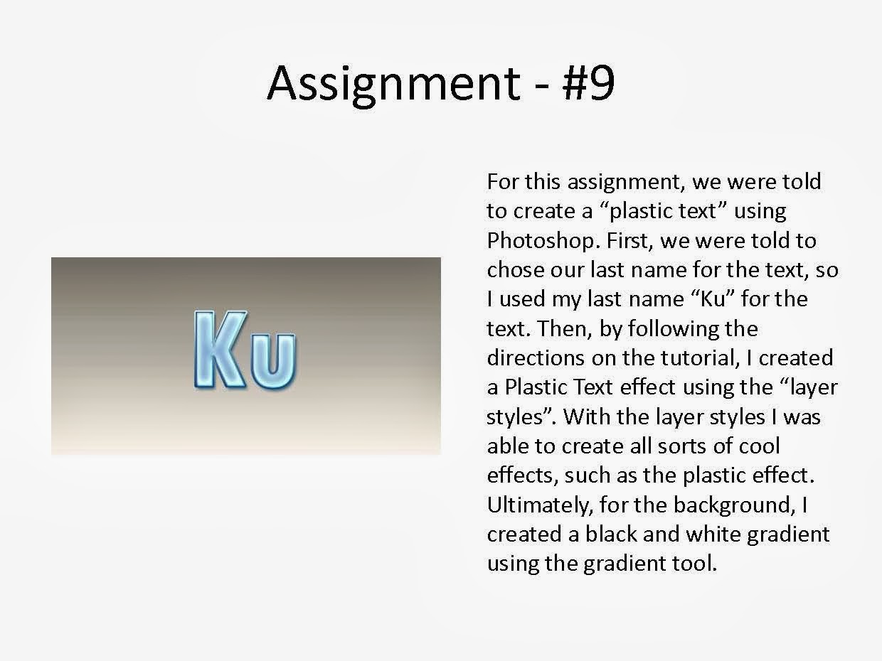
Assignment # 19

For this assignment, we were told to create a USB drive using illustrator. To create this flash drive, I basically created multiple layers of rectangles and different shapes and filled it with different gradients. For all the details of the flash drive, I followed the directions on the tutorial, and applied it to the different shapes, in which I was able to manipulate the lights and shades of the different shapes.
Assignment #20

For this assignment, we were told to create a wireless phone using illustrator. To create this phone, I mainly used the offset path option and I also created multiple layers of rectangles and other shapes to create this phone. In addition, in order to make the phone look more realistic, I used various gradients and manipulated them in order to create a three dimensional phone. For all the other details on the phone, I basically followed the directions on the tutorial for this phone.